# 41
Lines of the Leon.

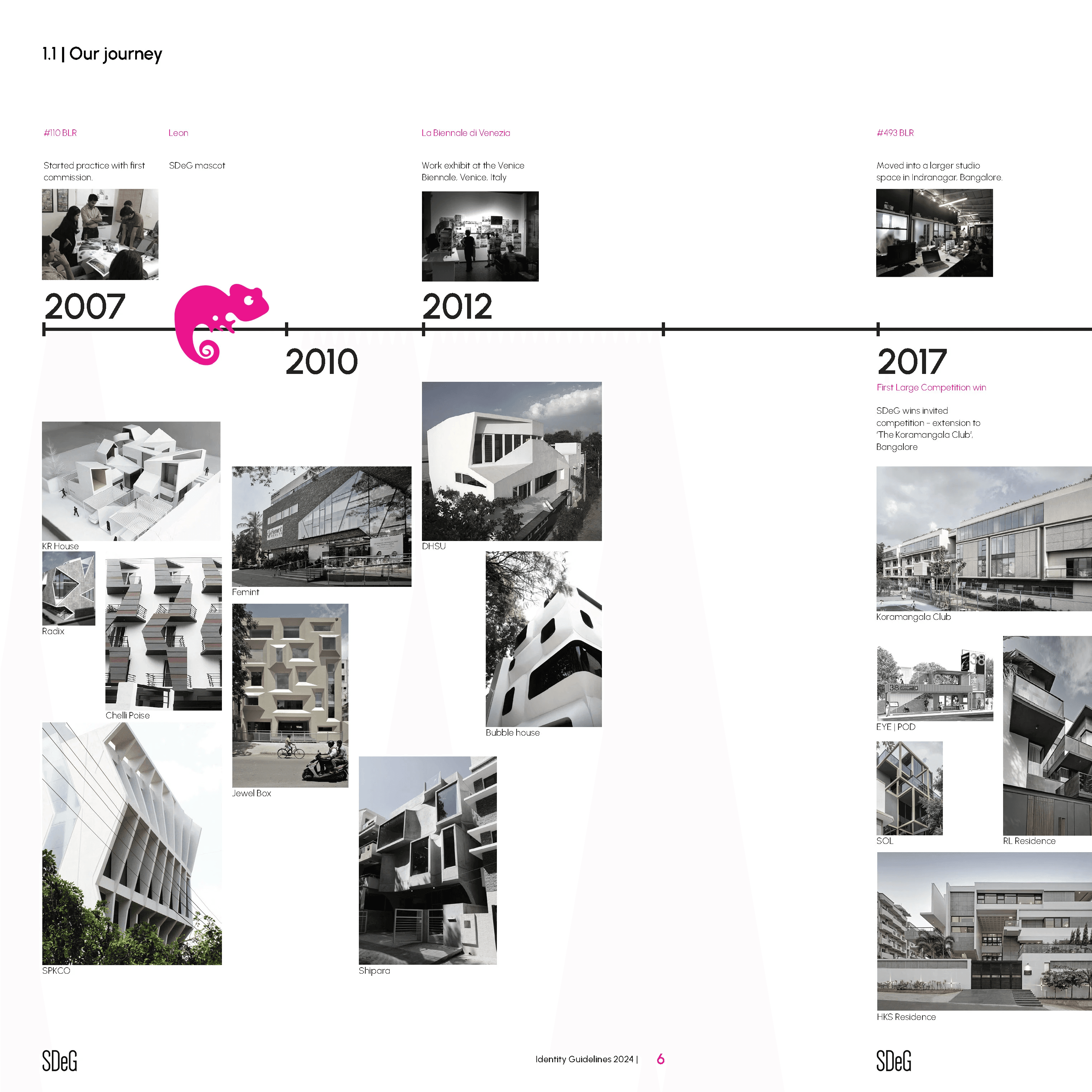
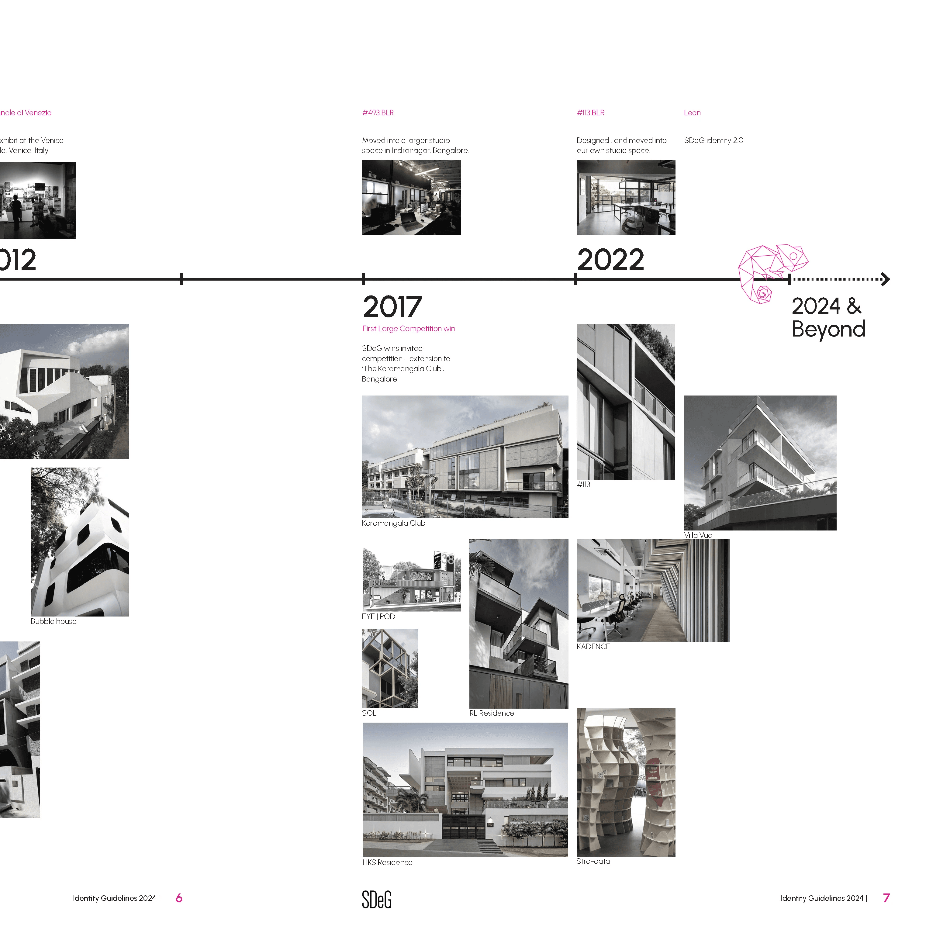
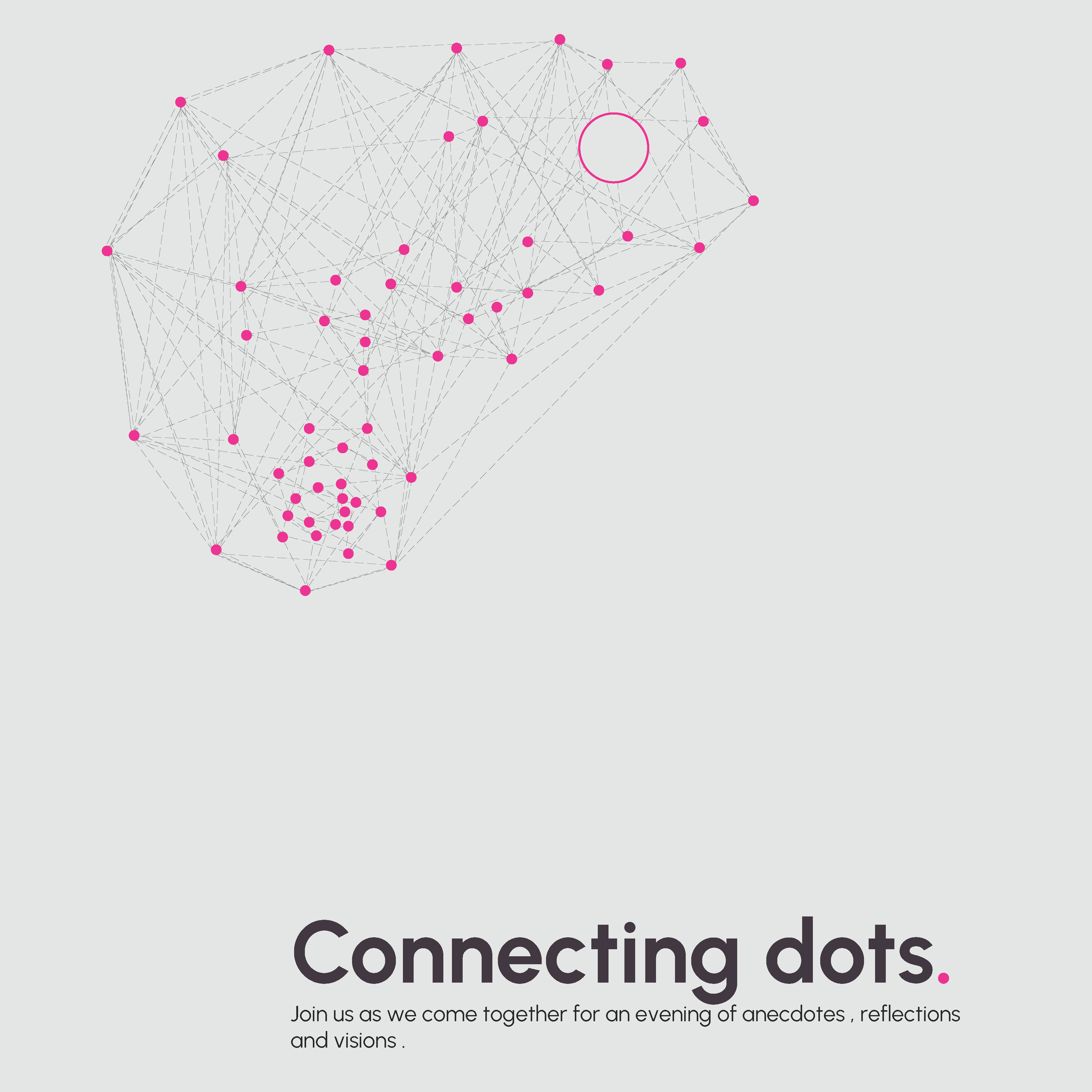
Rebranding a company that is more than 15 years, calls for a momentary pause of simultaneous reflection and envisioning. It carries the learning of the past and the shaping of the future

Description
Client:
SDeG
Year:
2024 [completed]
Design team:
Satyanand M, Nikita Baliga, John George
Collaborators:
Printer : Kolor Kode ; Brand Merchandise : Lysh Gifting
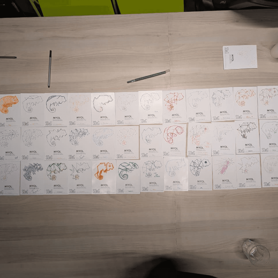
We had the opportunity to rebrand a very well known and respected architecture practice. Since the practice already had a strong identity, we worked closely with the founders to bring a visual consistency, the freshness of restless curiosity and the maturity of a 17 year old practice. The exercise culminated in a workshop titled ‘Connecting dots’, aimed at onboarding the team to the new brand language and presenting the outcomes of an identity guidelines document, brand merchandise and a brochure. We are open to architects TOO.